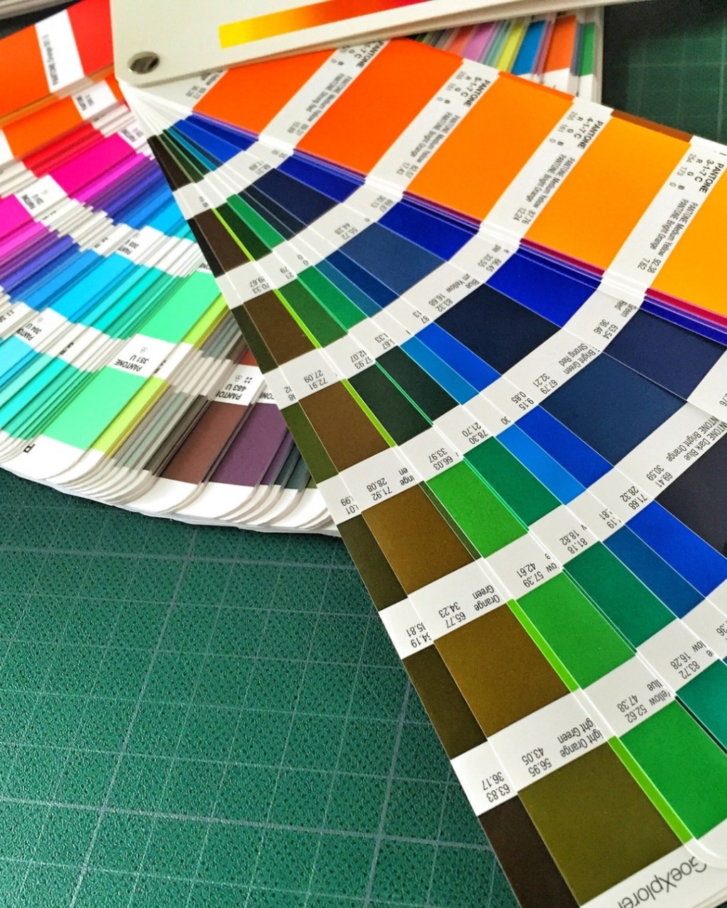
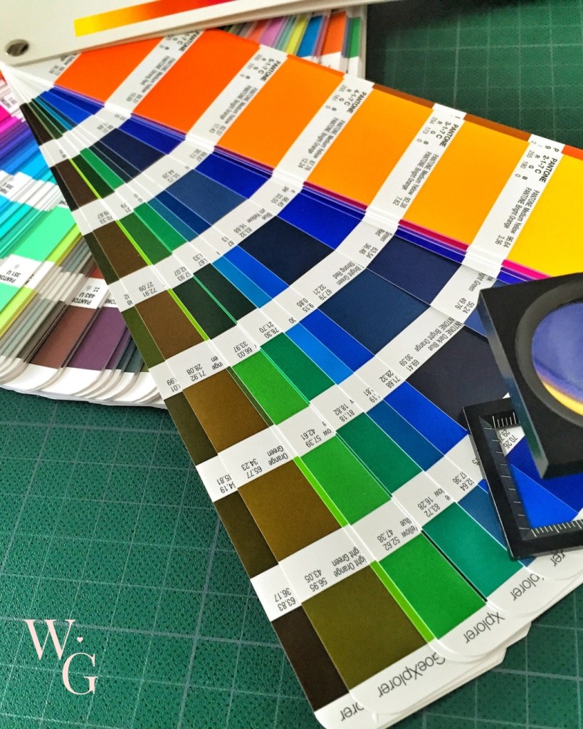
I recently had my colour analysis done by a friend, and it’s told me so much about my aesthetic appearance, and why certain colours have never quite worked on me. Why some makeup shades drain me completely, or make me look like a child who’s been left alone with a makeup bag and far too much enthusiasm.
It all really began when I stopped dyeing my hair very dark and let it grow out naturally. Within five years, I went from dark brown to silver, and my clothes and makeup had an absolute hissy fit during the transition.
Here is what I discovered about myself. If this is something that interests you, follow my journey as I slowly update my wardrobe and make-up looks.
My skin undertone
I was told my skin undertone is a cool-neutral (leaning cool). My skin shows pink/rosy redness rather than yellow/golden. Even where there’s flushing, the base underneath reads cool with no obvious golden or peach cast.
“You’re not icy cool, but definitely cool-neutral, not warm.”
During skin analysis, they often look for any olive tones. I don’t have any true olives.
“Olive skin usually has a green/grey cast under redness. Yours is pink-based rather than muted green. Your redness sits on top of fair skin, not within a green base.”
My overall contrast level
Looking at my aesthetic as a whole based on my hair, skin and eyes, I apparently have a low to medium contrast
Hair: light ash blonde (grey)
Skin: fair
Eyes: soft medium brown
“Nothing jumps out as stark or high-contrast. You would look most harmonious when colours blend gently, not when they’re sharp or extreme.”
Skin tone: Fair, cool-neutral, pink-based
Eyes: Soft brown (not very dark, not very bright)
Hair level: Light blonde (approx level 8–9)
Hair warmth: Neutral-cool (no strong gold or copper)
Chroma of my complexion
If, like me, you have never heard of this term “chroma” before, besides in a chemistry lab at school and don’t remember it.
“The chroma refers to the intensity, purity, or saturation of your skin, hair, and eye colours, distinguishing whether you are bright (clear/vivid) or soft (muted/subdued). It measures how much grey is mixed into your natural features, with high chroma indicating vibrant, clear tones and low chroma indicating delicate, “dusty,” or blended tones.”
(thanks Google)
My colouring palette should be muted rather than crisp, as very bright or neon colours would overpower you.
“You shine in slightly dusty, gentle tones”
Chroma of my eye colour
The chroma of my eyes is soft to medium, with no high-contrast or sparkling clear. This works beautifully with softened shades rather than jewel brights.
How much warmth in my hair?
Now my hair is silver, there is very little warmth in it, so it sits within neutral to cool.
“A warmer blonde would likely increase facial redness
Ashy or beige tones are more harmonious.”
Your colour season (12-season system)
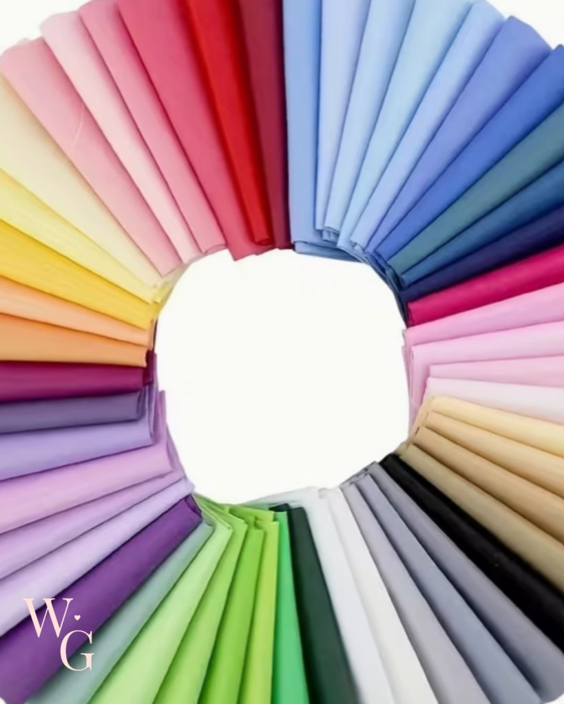
Based on the above analysis, my colour season using a twelve-season system is soft Summer.
This fits perfectly with:
- Cool-neutral undertone
- Soft, muted colouring
- Low–medium contrast
- Gentle eyes & light hair
Colours for me based on my analysis
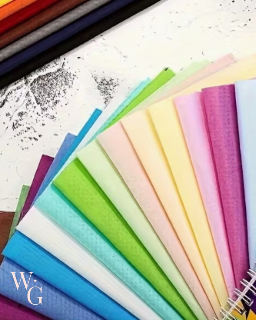
For me, the colours that truly work are soft, calm, and slightly greyed, the kind that don’t shout, but quietly settle in. Think dusty rose, mauve, and blush, alongside soft berry tones like raspberry rather than anything leaning towards a bright red. (Damm, I love a bright red!) Blue-grey and soft navy feel grounding, while lavender and periwinkle add light without overpowering. Greens work best when they’re muted and natural, sage, eucalyptus, and a softened teal, and my most reliable neutrals live in that gentle space too: mushroom, dove grey, and soft charcoal.
On the other hand, some colours need a bit more caution. Pure white can feel too stark against me, jet black often reads harsh, and anything overly bright, coral, orange, strong yellow, or highly saturated and neon shades tends to overwhelm rather than enhance. When it comes to neutrals, soft navy, cool taupe, mushroom, blue-grey, and soft charcoal are far kinder choices for me than true black, creating contrast without stealing the show.
All this is very exciting, and part of it resonates with what I knew about colours that suit me. I have always loved a crisp white blouse or a new white t-shirt, but it has never loved me back. When I wear something black, my son always says it is “not me”, so I need to soften it with a scarf.
Follow my journey as I blog about the changes I will be making. I popped onto Pinterest to screenshot some soft summer colours inspo that I can keep on my phone for when I am out charity shopping, and I treated myself to a new lipstick in the recommended shades.
Love and hugs


Leave a comment